Labeling your four AI tiers Easy, Medium, Hard, and Elite doesn’t make the ladder real. The ladder is a promise to the player that each step up is meaningfully harder than the last. That’s a testable claim. Here’s how we prove it — and what the proof looks like.
The promise a difficulty selector makes
When you pick a difficulty tier, you’re trusting the game that the tier below is meaningfully easier and the tier above is meaningfully harder. If any of those steps is too small, the tier is filler and players skip it. If any step is too large, the tier is a brick wall and players give up. A badly-graduated ladder is a bad game experience even when the game underneath is good.
We can’t trust playtesting alone to prove that Cell Division’s ladder holds together. Your own hands know the game too well, and a handful of games from friends is a dozen samples against a big matrix of tiers and board sizes. So every time we change anything about an AI tier, we run a tournament — an all-pairs, all-board-sizes, both-players-first round-robin, 50 games per matchup, 9,000 games in total. A laptop does it in a few minutes.
What “graduated” actually means
For the ladder to hold together, two claims have to both be true:
- Win rate strictly increases as you move up the ladder. Hard beats Medium more than half the time, and by more than Medium beats Easy.
- Score differential grows, not just flips sign. A ladder where Hard wins by half a cell is a fragile ladder even if the sign is right.
Both claims have to survive across board sizes and across first-player assignments. A difficulty ladder that only holds up when the AI goes first is not a ladder, it’s a coin flip.
Two charts, because one number lies
Score difference alone lies. An AI that wins by +2.3 points on average can still be losing 40% of its games — the big wins drag the mean around. Win rate alone also lies. A 55% win rate with 40% draws is a completely different game from a 55% win rate with 5% draws: the first says “both AIs are playing it safe and occasionally one slips,” the second says “one AI is clearly stronger.” You need both.
Reading the plots
Here are the two heatmaps as the tournament produces them. Each figure is a 5 × 2 grid: five board sizes stacked vertically, two first-player assignments side by side. Every cell is a full 6 × 6 matrix of [Easy, Medium, Blended Hard, Hard, Elite (linear), Elite (CNN)] against itself. “Blended Hard” is a measurement-only probe that sits between Medium and Hard — it’s in the chart so we can see the shape of the Medium-to-Hard gap, but it’s not a tier you can pick in the game.
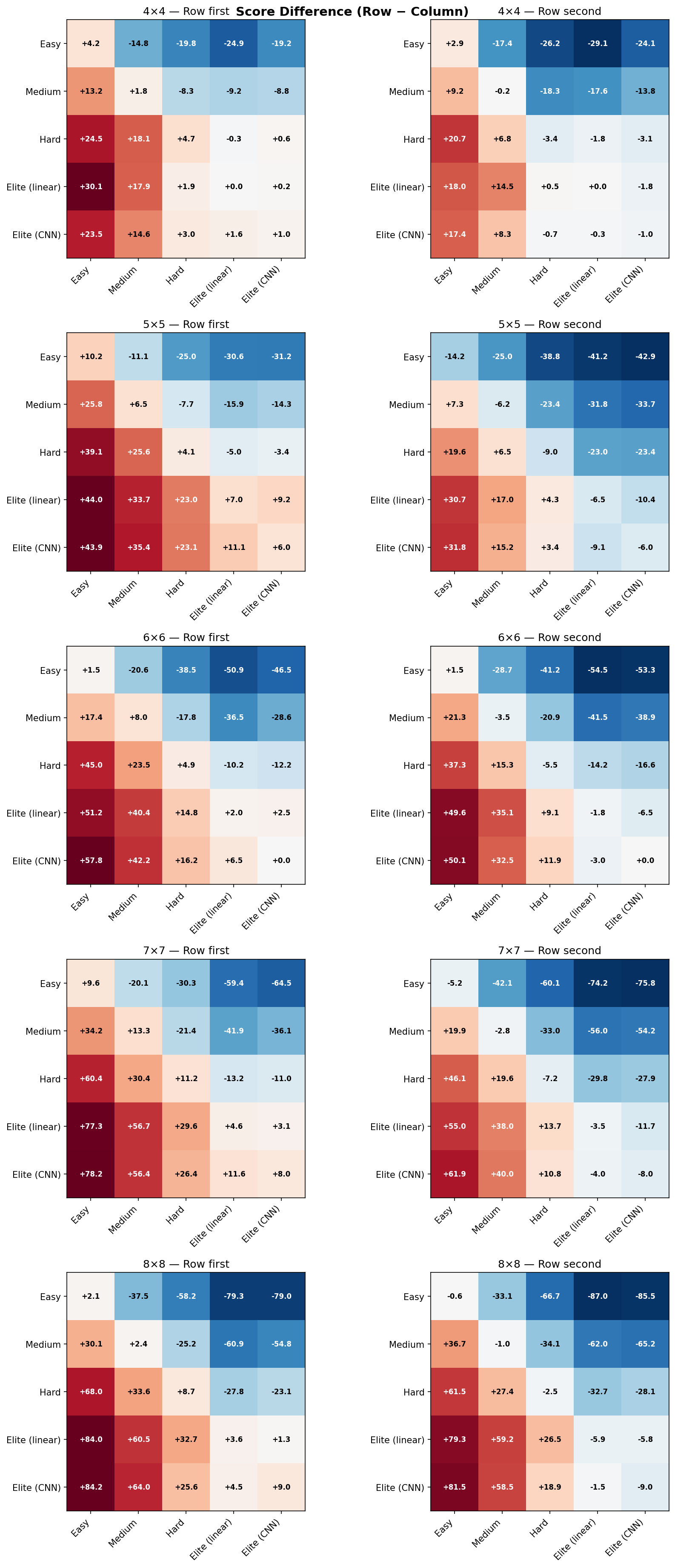
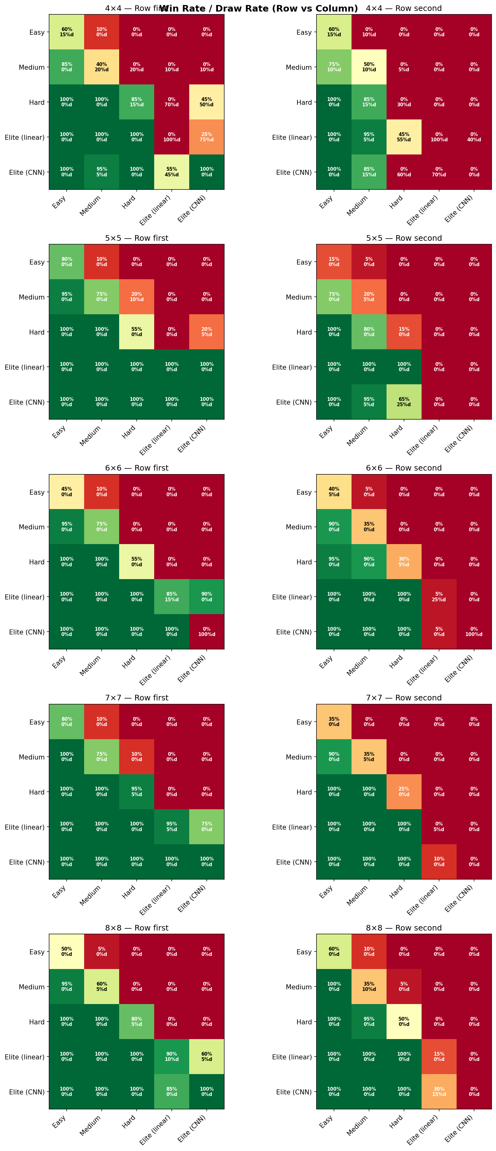
A few things the heatmaps make obvious the moment you print them:
- Board size is a knob on discriminating power. On 4×4 the whole ladder compresses — there are so few playable cells that even Easy stumbles into competent moves. On 8×8 the ladder is clean and monotone.
- First-player matters, and unevenly. Some tiers have a meaningful first-move advantage; others barely change. Showing both columns makes that visible instead of averaged away.
- Elite’s corner is red everywhere. The bottom-right of every sub-grid — Elite (CNN) vs. everything else — scores higher across every board size and every first-player assignment. That’s the evidence that the top tier is actually the top tier.
The point of this whole exercise is that the difficulty ladder is a measurement, not a decoration. When we say Hard is harder than Medium, we mean it in a way that you can point at. And when we change any part of the AI, we re-run the tournament and confirm the ladder still holds before we ship. No tier survives on its label alone.
For developers
The full engineering writeup — the round-robin script, the seed-pinning bug that was hiding in Math.random(), the Medium retuning the heatmap surfaced, and the “Blended Hard” probe we invented just to measure gaps — lives on the Island & Pine studio blog: Proving your difficulty ladder is real.